MN Code Camp - Case Study
Stakeholder Interview / Personas / Journey Map / Task Flow / Prototypes
In partnership with community enrichment programs in Minnesota, MN Code Camp (Abamath) involves students in coding and robotics classes throughout the summer in order to promote problem solving skills and increase STEM education.
The goal of this project was to increase awareness, engage more youth and drive registration of Abamath community education courses. To accomplish this, the UX design team researched STEM education and summer programs, assessed competitor's products and conducted a stakeholder interview to come up with a design strategy for the project.
Stakeholder Interview
The UX design interviewed the primary stakeholder as a group to gain some insight on the goals and the future of Abamath:
- Increase participation in summer programs
- Successfully launch Code Championships (Abamath follow-up) this August
Following the interview, a few issues that might prevent the growth of the company were identified. Abamath is a great program, but not an identifiable brand. Initially, Abamath was a tutoring service, which is no longer in existence. The client expressed their openness for a rebrand for the summer programs. In addition, there are limited of sources available for obtaining information on summer programs, so the team's strategy addresses how to increase participation in summer programs through increased awareness and engagement.
The STrategy
The UX design team suggested a rebrand that aligned more closely to the company's current goals--MN Code Camp and Code Challenge. In order to increase visibility, the Abamath website would need to be updated, and the MN Code Challenge website would need designing. The strategy also involves a marketing plan, which includes community outreach through news and social media outlets. To further increase engagement, scholarships would be offered through the website along with customer testimonials and additional photos.
Personas
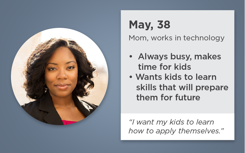
Common patterns of the client's intended users inspired the creation of three user personas. Each persona had different goals, behaviors and lifestyles, but they were all representative of the target audience. The overall design strategy was framed around meeting the goals of the user personas.


User Journey Map
Journey Map
A journey map was created to visually display the experience with MN Code Camp and MN Code Challenge.
Task FLow
This outlines the point of engagement throughout the process of planning, advertising and running the event, as well as preparing for the upcoming year.
- Phases of the project (month-by-month) breakdown
- Community engagement tactics
- Digital engagement tactics
Task Flow Diagram


Community Engagement
Marketing plans and media plans were developed to outline the strategy for seeking media sponsorships and outlets, conducting demos at various locations and for social media engagement.
Maximize return of participants
When students enroll in MN Code Camp, they will be given a t-shirt and asked to wear it when they participate at MN Code Challenge later on in the summer. The goal is to increase awareness and visibility of the two programs as a unity in order to boost registration.
At the end of each MN Code Camp course, students and parents are each presented with surveys to help gain insights as to what was enjoyed about the program and to gather testimonials for the website and informational materials. These surveys may also help shape course content in the future.
Encouraging sign up for the email newsletter allows for the client to contact current, past and potential participants and keep them informed on the programs throughout the year.
MN Code Camp Website, MN Code Challenge Website
Digital Engagement
MN Code Camp website is a re-skin of the current Abamath website. A "Why kids should code" section was added to the "About" page and the "MN Code Challenge" page now offers scholarships to help get other students involved and testimonials.
The MN Code Challenge website allows parents to register their students for the event, incorporates social media happenings, includes data/factoids about why kids should code and a countdown to the event.
The UX design team put together a video presentation of the project.
Key deliverables and measurable data was captured into a timeline, along with a cost breakdown and a list of the individuals who would be involved on each task. It is important to evaluate the progress and success of a project, so an outline of key performance indicators was documented in a design implementation plan.
- Measure engagemen through documenting shares, visitors bimonthly.
- Adoption: manage purchases, subscriptions
- Retention: track how many students attend both summer programs and how many return the following year
- Satisfaction: gather testimonials and synthesize surveys
- Engagement: identify key search words and use them as leverage for how to format social media posts and website content for future iterations


