
BounceTribe Website Evaluation and Usability Testing
Usability Review / Scenarios / Usability Testing / Data Synthesis

BounceTribe allows aspiring musicians and professional mentors to connect through uploading in-progress projects and providing project feedback.
The Approach: Usability Review
The first step was to conduct a usability review, assessing the site's pages and overall functionality. Through this examination, the team noticed a few key issues that might cause confusion or frustration among BounceTribe users. In order to determine whether the site's current functionality was in alignment with the client's goals, the UX team decided to take a closer look at what issues would directly impede the success of the client's site goals.
The Challenge
BounceTribe approached the UX team to gain feedback on the usability of their website during its development stage.
Client's site goals:
- Connect aspiring musicians to professionals.
- Enable professionals to teach aspiring musicians.
- Allow musicians to critique each other on their work.

Goals of the evaluation
In order for the site to be successful, each member must know how to complete basic tasks: finding/adding friends, uploading projects, and communicate through feedback/messaging. This insight determined the evaluation goals for the test:
- Determine whether users are able to perform basic website tasks
- Verify whether the current navigation model is or isn't working
- Rate learnability and understanding of site concept
- Gather insight on user's interpretation of website language/jargon
Scenarios and Usability testing
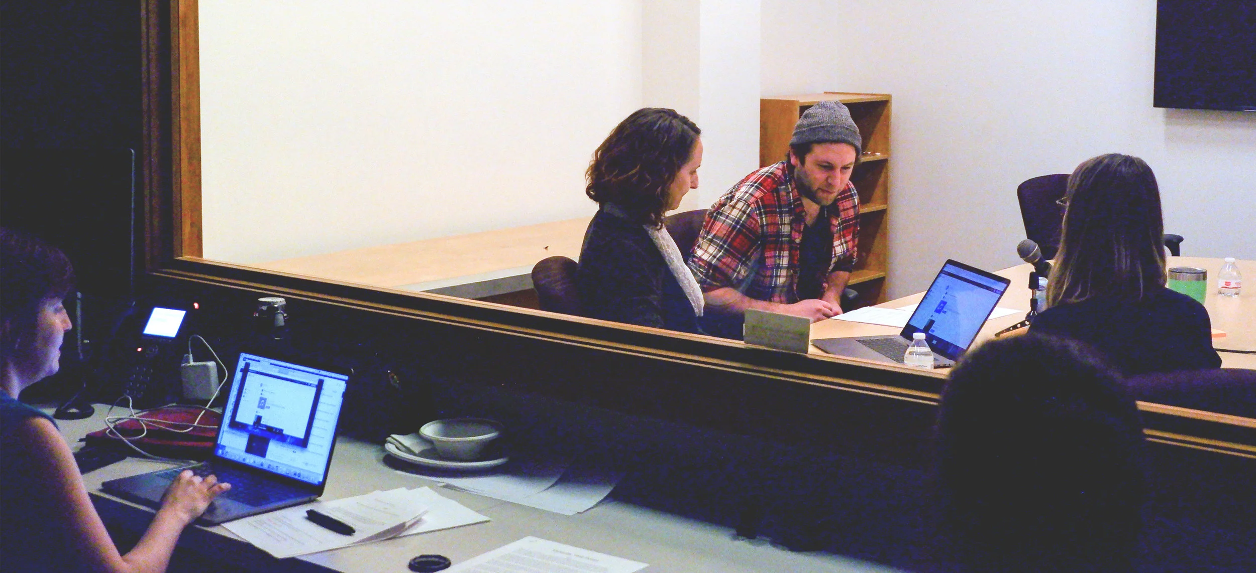
Usability testing was conducted in order to observe what components of the website were most troublesome for users. Participants completed six tasks and scenarios in remote and lab test settings. Evaluations included participant observation of a website walkthrough and think aloud protocol as participants completed the tasks and scenarios. Participants were also asked questions regarding their understanding of the site’s language and goals. Observations on the level of participant frustration throughout task completion, statements and other cues were factored into the severity of the usability issues.

Usability review: heuristic analysis and findings
Data synthesis
Using Trello as a design tool, the data was grouped, organized and sorted to highlight patterns of usability issues and common pain points among participants.
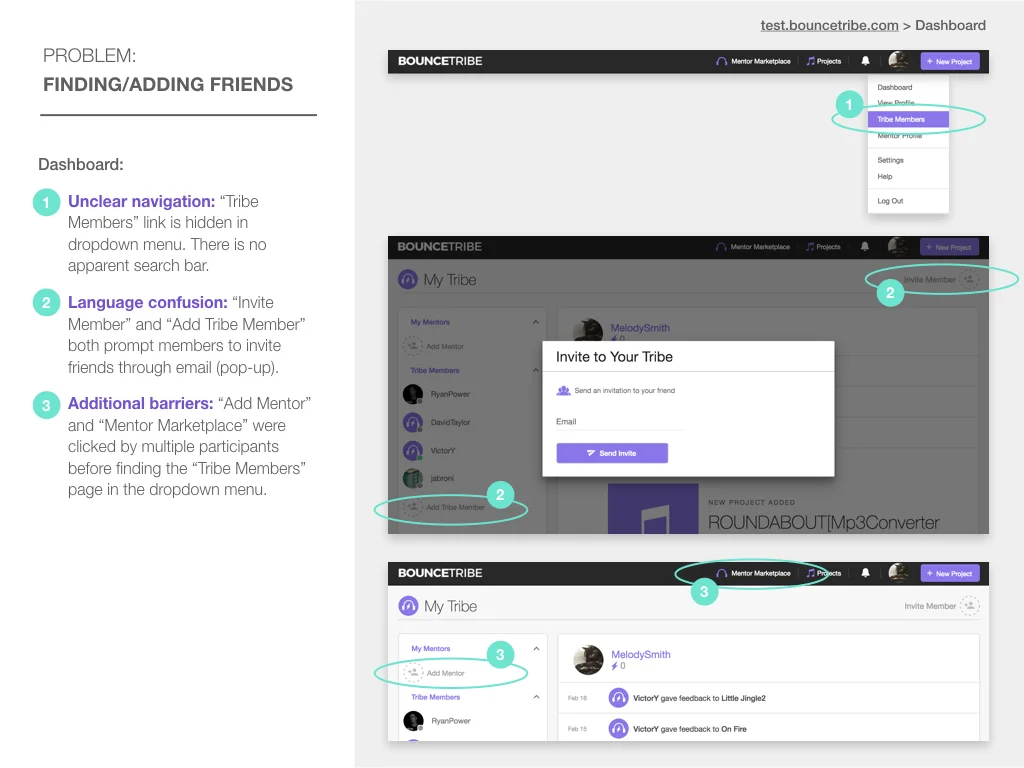
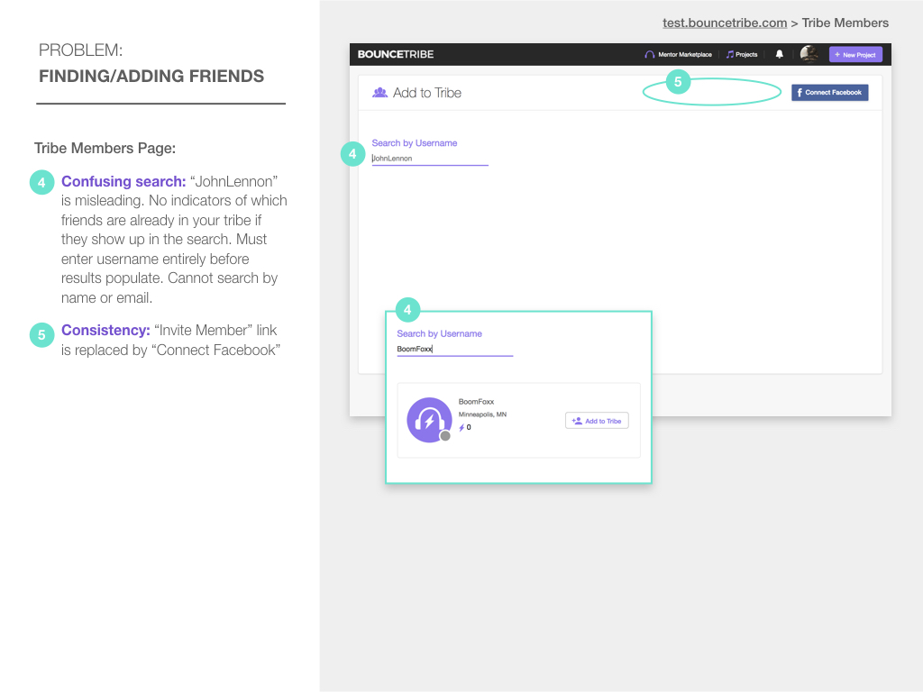
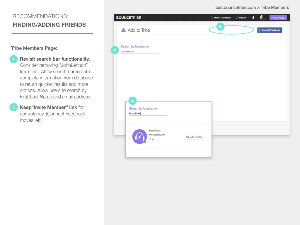
To meet the client's goals of the site and maximize musician connections on BounceTribe, members must be able to search for/find other musicians in an effective and efficient way. The process of searching for and adding friends on the current website prototype was confusing for almost all of the participants who tested the site.
It's also important for BounceTribe members to be able to upload projects easily and communicate with each other using various points of contact. Participants didn't have many issues uploading projects, but they could not grasp the methods of communication. They did not know the difference between ideas and likes and could not figure out how to send private messages.


Usability findings
Top usability issues were determined by the amount of difficulty and frustration the participants experienced when completing the scenarios during the usability tests.
- Unclear navigation made finding and adding friends difficult.
- Lack of visibility and feedback on the project pages confused participants when they tried to critique members' work. Users were unsure if their comments were posted.
- Participants faced an extreme mental model mismatch when trying to send direct/private messages to other members.

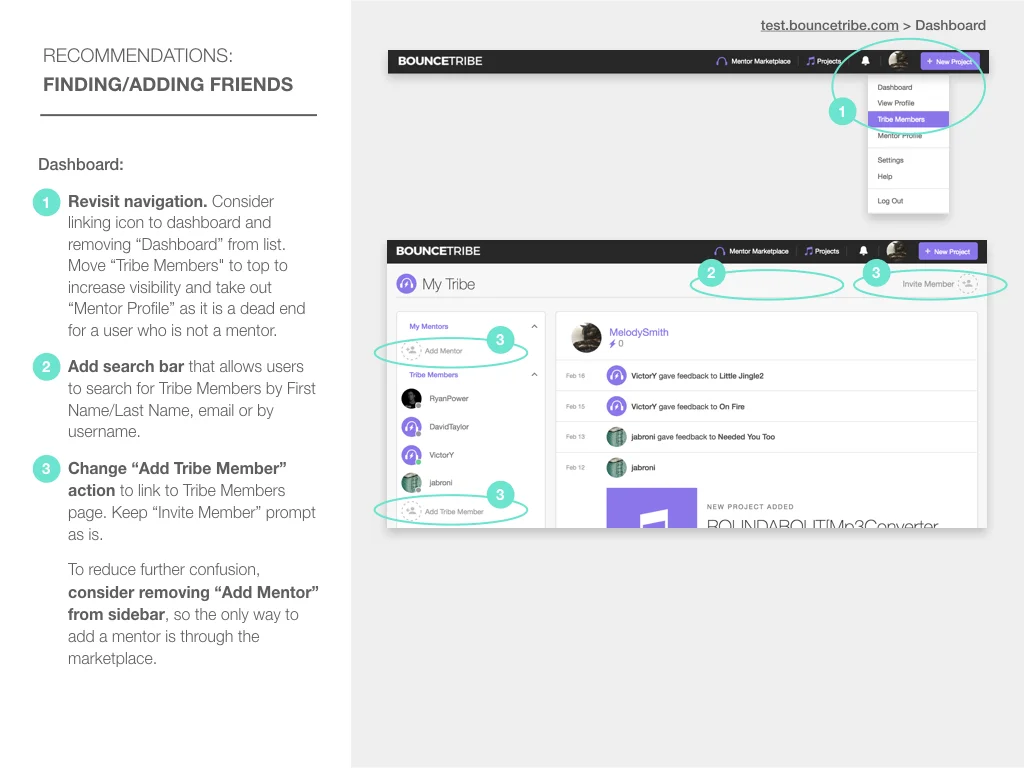
Design recommendations
Moving forward, it's crucial for the BounceTribe development team to revisit functionality of the feedback segment on individual project pages. Revisions should include clear differentiation between "ideas" and "notes", and a clear indication that a member's feedback has been posted. BounceTribe development team should reconsider the navigation structure to make the process of searching for/adding friends more intuitive. Additionally, separating the messaging section from the member profile would help users access direct messages more conveniently.