Cushman & Wakefield Case Study
User Research / Contextual Inquiry / Cognitive Walkthrough / Task Analysis / Wireframes / Interactive Prototype
Cushman & Wakefield's new platform of tools seeks to gain traction with prospective clients and provide useful information to their customers.
The Challenge
The commercial real estate company, Cushman & Wakefield, developed concepts for a series of web tools that aim to assist clients with their real estate decisions, and generate connections with prospective clients through email. In order to enhance the overall experience of the platform of tools, Cushman & Wakefield approached the UX team to assess the product and make design recommendations.
DEFINING THE PROBLEM
The UX research team worked as a group determine the client goals, their intended usage for the platform and gauge potential customers’ comprehension and satisfaction with the product. The findings would shape the product re-design.
In order to gain a close understanding of these products, the research team met with two representatives at the Cushman & Wakefield office. The affiliates were met with individually, and each affiliate was interviewed about their workflow and usage of the product. Based on the interviews, it was determined that the platform served primarily as a lead generating tool, while providing useful data to their prospective clients.
Following the contextual interviews, the research team sat down with two potential customers. They were each presented with a series of tasks to perform on Cushman & Wakefield's platform and asked to remark on their findings. These interactions made it clear that there was a mismatch between what the client was offering and what their customers were looking for.
Cognitive walkthrough conducted on original site concept (top).
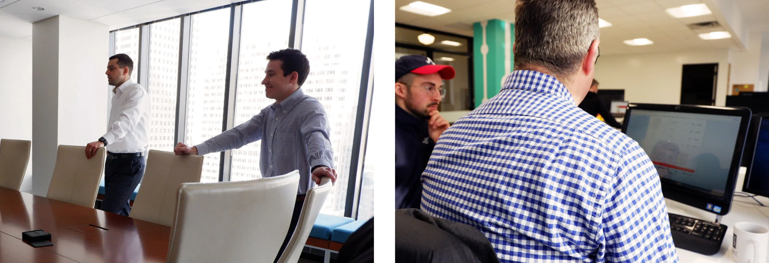
Clients at Cushman & Wakefield (left). UX team conducting usability testing on concept site (right).
Low-fidelity sketches indicating site flow.
Key (Usability) Findings
The clients’ concept site, presented each of the three tools to the customers separately, in a navigation bar on the landing page. The inconsistent flow between the tools made potential customers unsure of how to use the site. The site had excessive text with unclear language, and lacked sufficient feedback to the potential customers, making it difficult to understand each of the tool’s intended purpose.
Following the research, the data synthesis and design iterations were completed individually.
Significant data from the client and customer interviews was synthesized for the development of the prototype. The overall intent of the prototype was to find a way to present the individual tools as a cohesive and intuitive system to the customers.
Primary Design Recommendations:
- Simplify tools by discarding any unnecessary or repeated information to make it easier for customers to understand
- Streamline the flow between tools
- Clearly indicate system status


Prototype
The prototype guides the clients through the platform, one tool at a time. This eliminates the use of excessive data forms by instead presenting only one form to the customer at the beginning of the process. Between each tool interaction, the new design features a clear explanation and instructions for the tool as well as a suggested redesign for the configuration of two of three tools. Each tool communicates the intended value to the customer through providing data and facts to support the usage of the tools. With the new platform, the customer is able to clearly navigate through the set of tools with improved visibility and appropriate feedback.


